
Gradient website v36

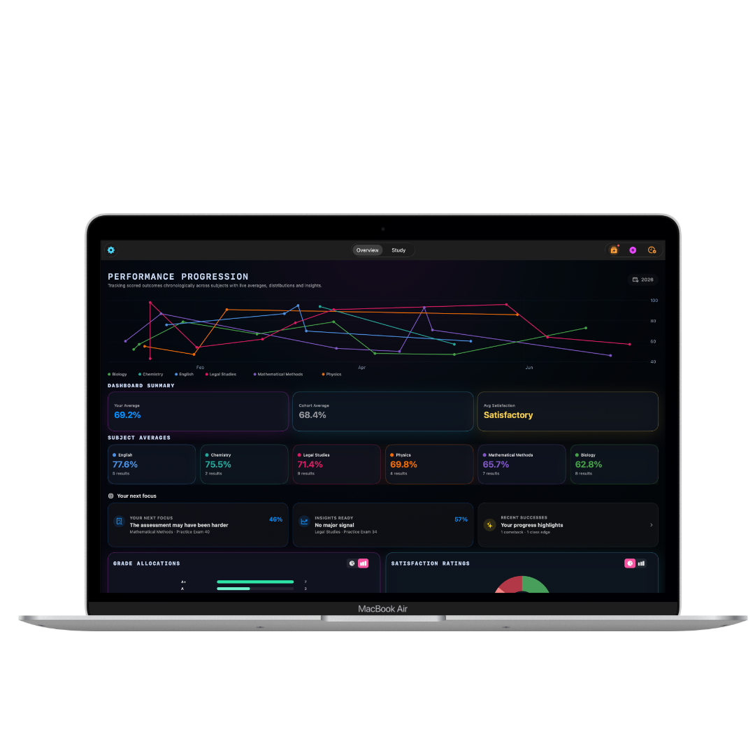
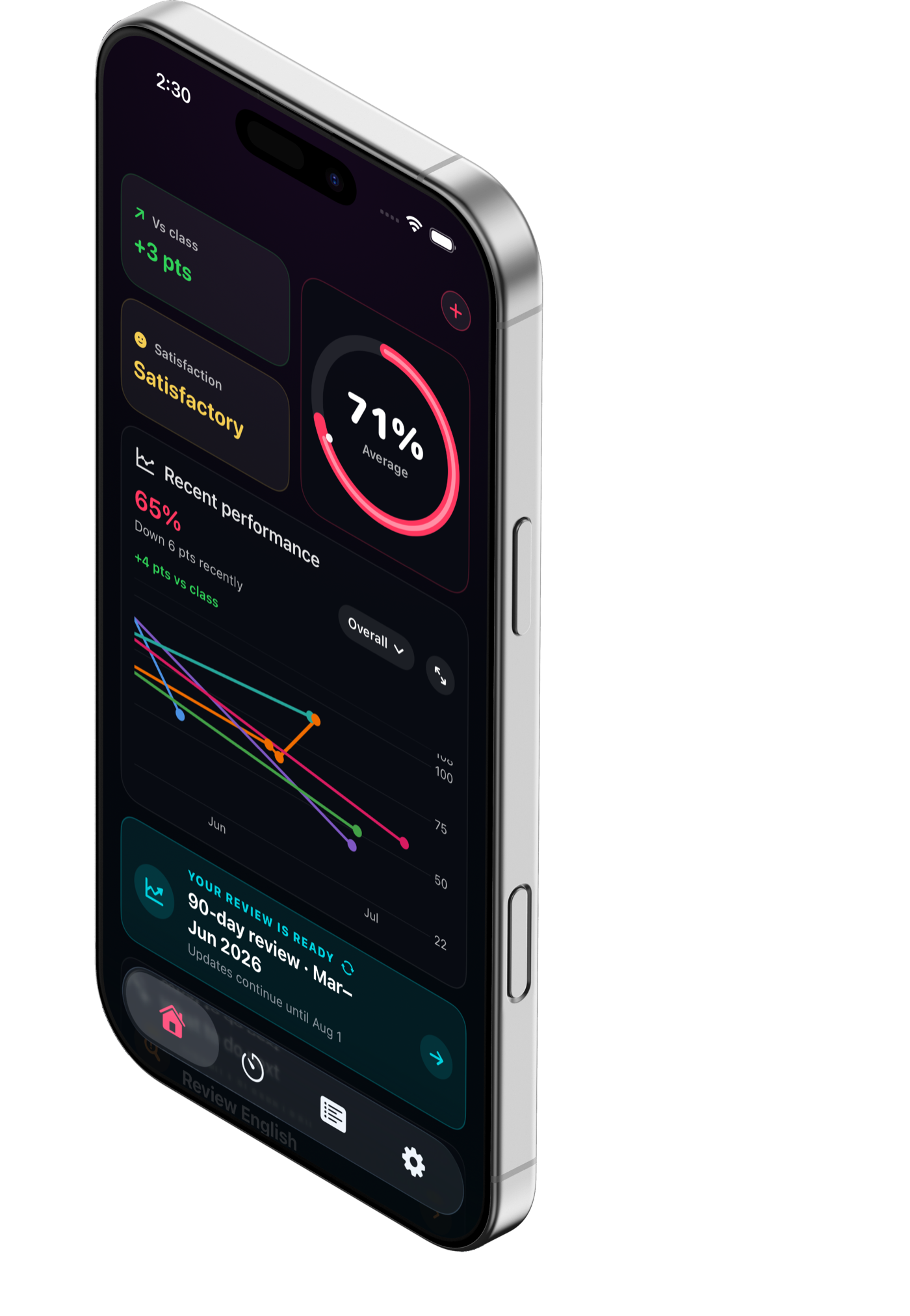
Rendered desktop and iPhone previews of the responsive and animation changes.

The phone, laptop and logo artwork shown here uses neutral stand-in assets because your final high-resolution image files were not attached to this chat. Their positions, scale, spacing and responsive behaviour are rendered from the actual v36 code.

iPhone landing page

Safe-area-aware header, hamburger menu, tighter mobile hero composition.

iPhone landing page preview

iPhone navigation open

The hamburger changes to a close icon and the menu closes after navigation.

iPhone navigation open preview

iPhone feature animation

Feature motion now begins when the visual demo itself reaches the viewport.

iPhone feature animation preview

iPhone study streak

The stacked mobile feature layout with the delayed streak animation.

iPhone study streak preview

iPhone waitlist

Dark form controls replace the bright white input fields.

iPhone waitlist preview

Desktop landing page

The shared device composition has been moved higher without changing its ratio.

Desktop landing page preview